Living Style Guide
Design Principles
Foundations
Typography
Colours
Iconography
Spacing
Elevation
Interaction
Content
Product content
Tone of voice
Components
Alert boxes
Breadcrumbs
Buttons
Button groups
Cards
Chips
Empty state
File upload
Forms
Labels
Tables
Lists
Navigation drawer
Overlays
Pagination
Search
Snackbar
Tabs
Toolbar
Tour
Integrations
Symfony Forms
Logos
Error pages
Javascript
Button Control
Button group button Control
Checkbox Control
Element Creator
Element Control
Element Resolver
Event Control
Input Control
List Control
Material Checkbox Control
Select Control
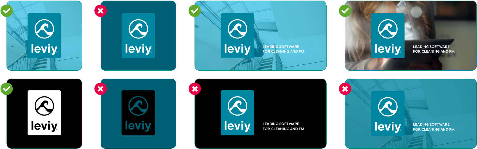
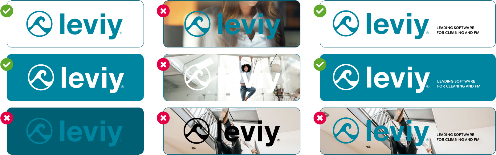
Logos
Usage
Logo
Logo (white)
Label
Favicon
Guidelines
Use enough contrast between the logo and the background
Use a solid background behind the logo
Usage
Guidelines

